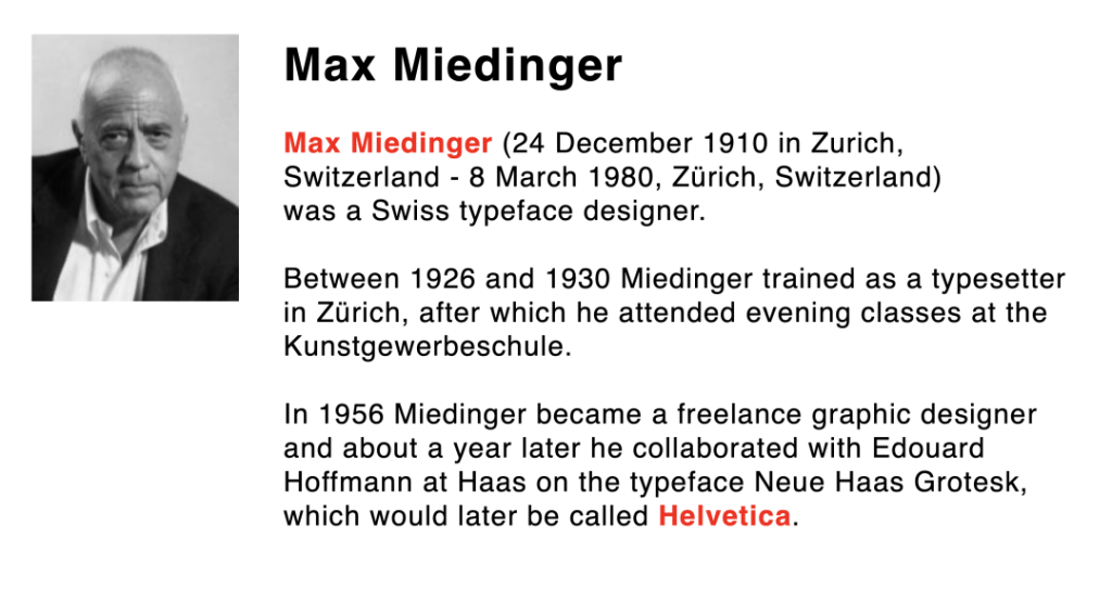
What fonts did Microsoft and Apple choose, and who designed them?
Where did Facebook and Google's fonts originate?
The University of Wisconsin chose to change the font to save ink?
Have you ever paid attention to the art style of western fonts?
Let's go through "Typography 1", a Sino-German course.
Come and enjoy the visual appeal of Western fonts.
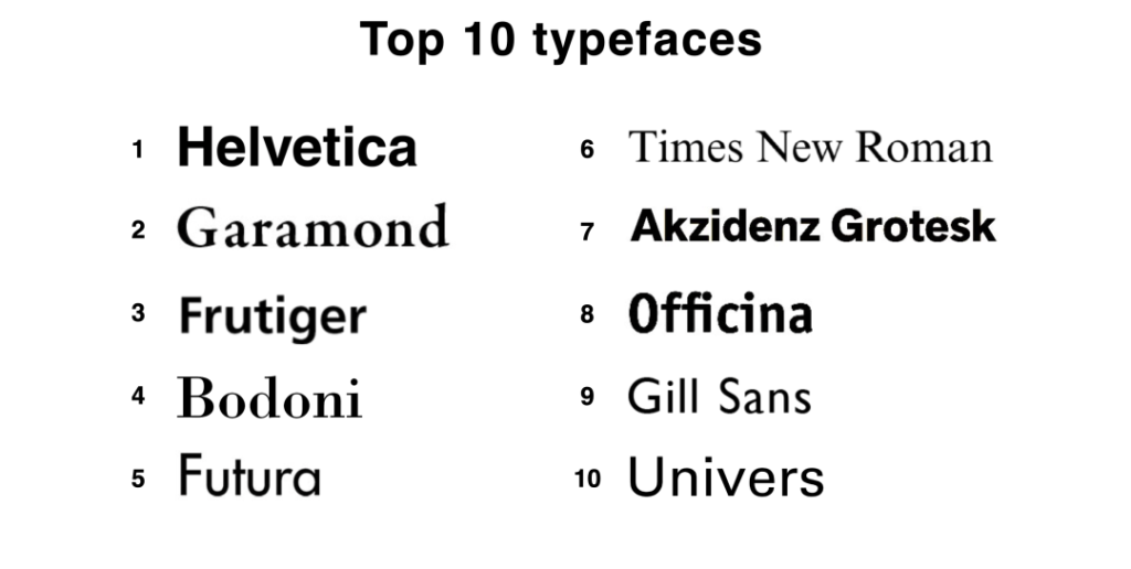
In the 6-week course "Latin Typography", the students of the Sino-German School of Design and Communication (Sino-German 2+2 Dual Degree) in Visual Communication Design 21 were initially exposed to the Latin typography.Historical knowledgeThe Latin fonts were studied in depthStructure, arrangement, content and selectionThe class was taught by Jan Tomas. The instructor, Jan Tomas, introduced the students to the ten classic Latin fonts, starting with the tenDesign background, features and design application.
Course Introduction
Typography course byProf. Jan TomasProfessor Tomas will not only introduce students to the basics of Latin fonts and interesting facts, but will also give them a chance to practice.Individual, targeted coaching and critique. In order to break through the flat stereotype of type design, this course is taught usingThe design direction of "developing visual narrative by combining type and architectureThe students will be able to develop their graphic design and creative thinking skills.
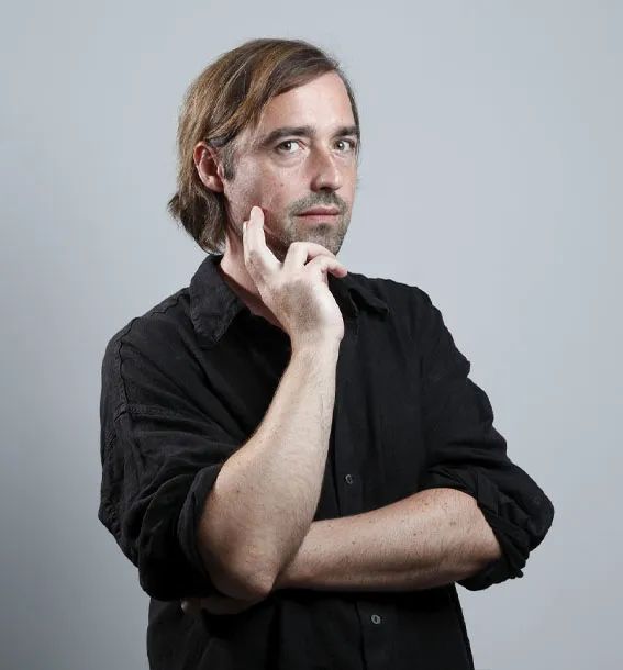
Mentor Introduction
Jan Tomas, a graduate of the University of the Arts in Berlin, has taught at Texas State University and the Academy of Fine Arts in Prague, Czech Republic, and is currently an Associate Professor at the Brand University of Applied Sciences in Germany.Multi-dimensional dynamic graphics and interaction design trendsHe founded Jan Tomas Design in 2000 and has provided type and interaction design for multinational brands and media.
Course Review
Each building records the temperament of a civilization and an era, and the aesthetics and wisdom of man are reflected in a building. As traces of the times, there is inevitably an interconnection between words and architecture. The modernist movement in architecture and the modernist movement in typography also originate from the same starting point and have the sameThe same concept and presentation.
Prof. Jan TomasThe type design courseFocus on font style selection, emphasizing font and graphic typography, text clarity and readability. The course is set upBrainstorming, pencil stirring, font selection, layout designand other steps, giving students the opportunity to learn fromInitial creative outbursttoFinal work presentationThe complete design experience.
The students were guided by Professor Thomas inA design journey where type and architecture are wonderfully combinedFirstly, we will browse widely the buildings of interest and conduct a simple research on the shape and connotation of the building, so as to line up the original complex architectural form; secondly, according to the selectedThe concept and original function of the buildingSelect a descriptor and chooseSuitable fontssketches of buildingsSimplification, coloring;;FinallyUnleashing students' creative thinking willFonts and ArchitectureThe organic combination of the fonts will form a unique font design.

Student Achievement & Student Evaluation
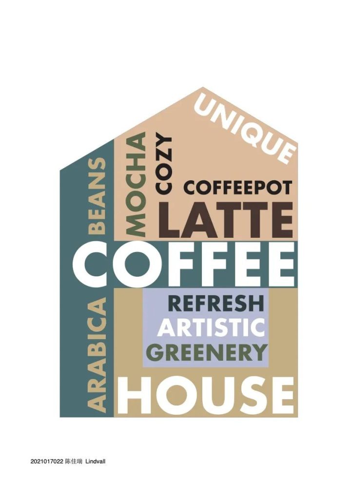
Visual Communication (Sino-German 2+2) 211 Chia-Rui Chen
TopicsCoffee House
Selected Fonts: Futura
WorksFutura is a sans-serif typeface inspired by the Bauhaus, a font that represents modernist design. In terms of the color scheme, I chose an American vintage style, which is also what I have in mind for a coffee shop, an immersive and relaxing atmosphere."
Course Evaluation: "Typography 1 is a very interesting course. We started with the initial selection of materials and modified our designs step by step. I learned a lot about the background of fonts and how to use them in the process, and Tomas was also very responsible, reviewing the work and telling us how to modify it in every class. After the course I felt that my thinking about type design had been opened up."

Visual Communication (Sino-German 2+2) 211 Zhou Zohan
Topics: Theater
Selected Fonts: Futura
Works: "I used Futura font, inspired by Bauhaus. Futura's fresh, clean form reflects a sense of efficiency and modernity, so I used it in the design. The color scheme was inspired by the evening light show at the Zhuhai Grand Theatre in Guangdong. I think the dark background and bright typeface better reflect the modernity of my design."
Course Evaluation: "Typography 1 was a very helpful course for me, and the teachers were very kind. They started with the initial basics and gradually increased the depth of details until the final big task. The teacher instructed us how to set up the Latin alphabet typography and showed us how to set the proper word spacing. He gave us feedback and one-on-one explanations for each assignment. These helped me a lot in completing the big assignments. Thank you very much to several teachers."


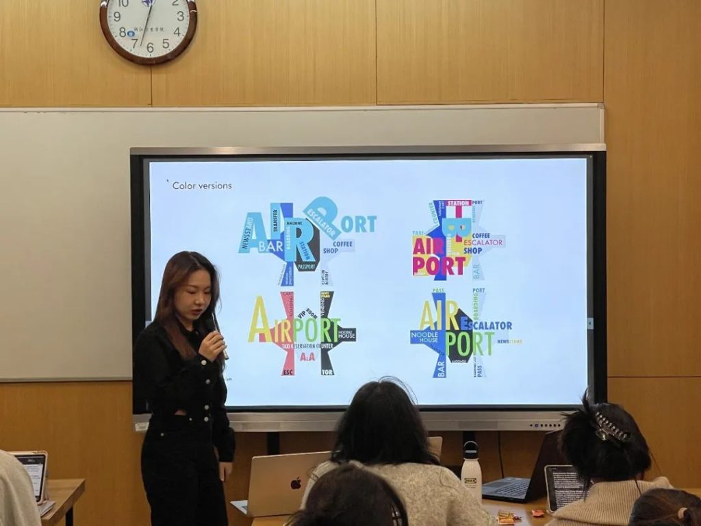
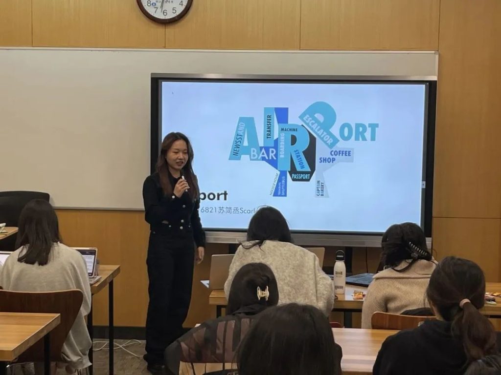
Visual Communication (Sino-German 2+2) 212 Su Jiancheng
Topics: Airport
Selected Fonts: Futura
Works: "The building I chose was Chengdu Airport. I started by simplifying the complex appearance of the airport into geometric shapes made up of simple lines, and then chose words related to the airport building to fill in the typography. The airport feels modern, scientific and efficient, so I chose Futura, a sans-serif typeface, to show this character. In the typography, I enlarged the word "Airport" as much as possible, so that people could see the theme at first glance and it would have a certain visual impact. In terms of color selection, I used a large area of blue and white related to the sky to make the colors relate to the theme, and added black to balance the colors throughout the piece."
Course EvaluationI benefited from the course "Learning Typography 1". The teacher made us understand the difference between serif and non-serif fonts, and led us step by step to transform figurative architecture into a work composed of line text. After a series of studies, I will make a conscious effort to optimize the typography of Latin, as well as make choices in the color scheme.
Tomas was very attentive and interesting in class, and his guided teaching encouraged us to ask him questions, patiently pointing out the shortcomings of our work and keeping everyone actively involved in the class. The teaching assistant for this course, Mr. Permission, was also very helpful to the students in learning this course and would give feedback to Tomas about the students' doubts and help them solve their problems with the software."

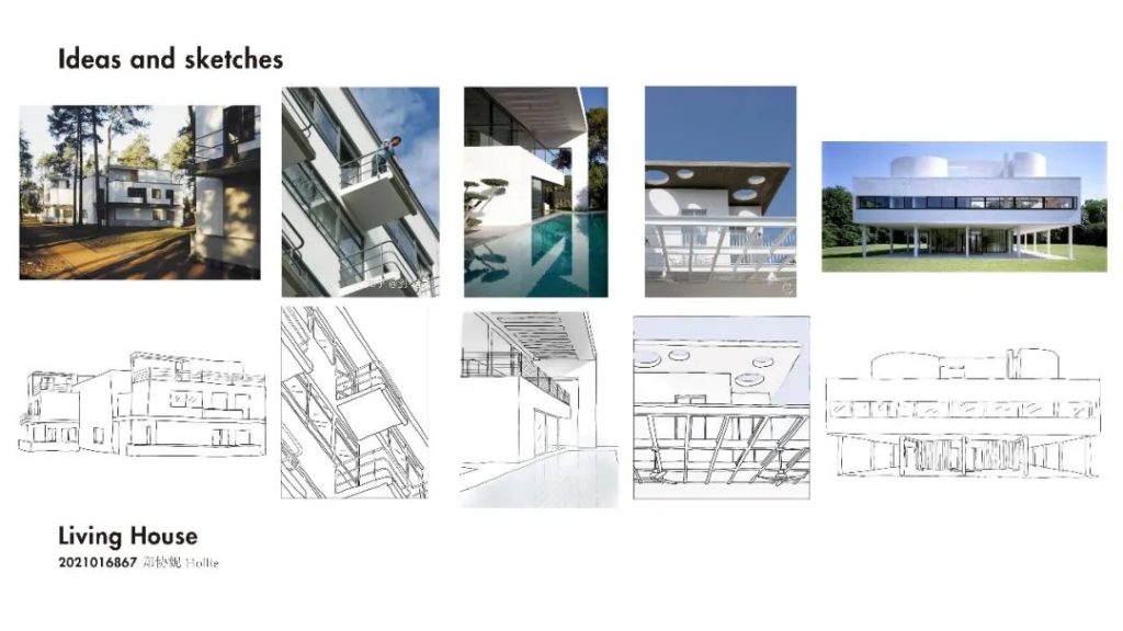
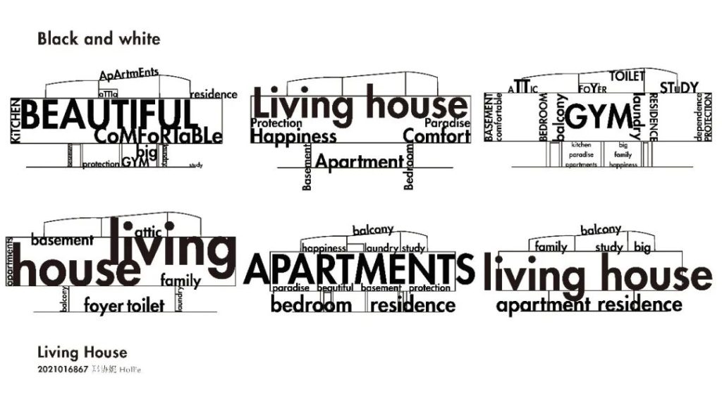
Visual Communication (Sino-German 2+2) 212 Pan Yue
Topics: Living House
Selected Fonts: Futura
Works: "I chose a modern house as my Living House, so I chose Futura, a sans serif font. I chose a retro color scheme for the color scheme. The lighter reds and blues are paired with the brighter yellows and flesh tones, making a strong contrast between the dark and light colors and making the piece more readable. In the arrangement of the text, I set LIVING HOUSE to the largest font size and placed it in the middle of the picture to highlight the theme of the work, and set the main color of this text to yellow, where the colors of the letters L and H are dark blue and dark red respectively to enhance the sense of design. I also chose words like FAMILY, LIFE, etc. to correspond to the theme of the work Living House. In the placement of the typeface, I chose both vertical and horizontal to symbolize the calmness and stability of people's daily life. The overall design of this work expresses my idea of the interior decoration of my future house, and the Living House I aspire to is such an American vintage style."
Course EvaluationTomas used a one-on-one tutorial approach and provided each of us with suggestions and design inspiration. In the process, I gained a deeper understanding of font selection, word spacing control and overall typography, and this course has benefited me greatly."


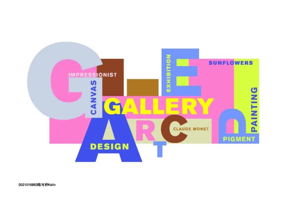
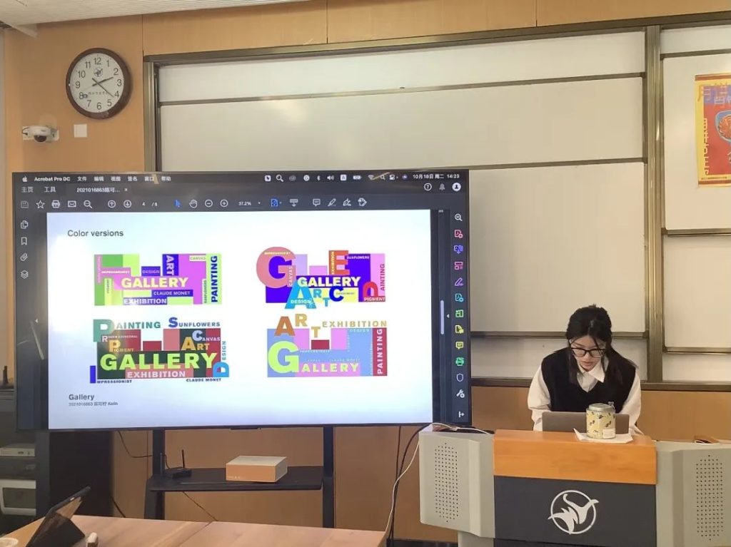
Visual Communication (Sino-German 2+2) 213 Chen Ke Lime
Topics: Gallery
Selected FontsAkzidenz Grotesk
Works: "I chose an architectural style that is modern and suitable for a sans serif font. At the same time, the architecture I chose is square, low and heavy, elements that match the impression I got from Akzidenz Grotesk as a typeface. Most of the words I chose are related to painting. The gallery as a whole I associate with is stylish and cheerful, with warm yellow lighting, a quiet atmosphere, brown frames of famous paintings, gray on canvases and crisp green plants around the corner of the gallery. So I chose warm tones like pink and yellow for the color selection. Accented with blues, browns and bright greens. I used high saturation colors to reflect the cheerfulness and low saturation colors to reflect my association with the details of the gallery. I used a layout with enlarged initials and interlaced text between letters to reflect a sense of liveliness, a sense of interlacing between the stairs and the gallery space, and increasing the depth of the space by changing the thickness of the font to add a sense of hierarchy to the image."
Course EvaluationThe Typography 1 course has been very beneficial to me, and my aesthetic and design awareness has grown as I have continued to learn more. In this course, I learned the basic principles of layout design and color matching, and how to make sure the message is clearly conveyed while keeping the image from falling into mediocrity. With the help of the instructor, I was able to upgrade my work and improve my design skills, which was very enjoyable and fulfilling. This way of teaching practice and theory simultaneously is very efficient."
Professor Thomas opened the door to type design for the students
Let us see the power of a small font to change the world
I hope students can use fonts well in their future designs
Let your work show in every stroke